
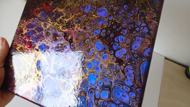
Color Shift is produced by FolkArt, and is described as a dynamic metallic paint with variable color in changing light. Essentially, this dazzling craft paint is a bit of a chameleon— for example, Emerald Flash looks like a rich, vibrant green head on, but if you tilt it just so, it has a teal hue.
Personally, I love these paints. The application of Color Shift paints in pouring just makes sense if you’re looking to add a little pop to your pour.
Beware of Over-manipulating Color Shift Paints
I’ve become fond of Color Shift paints, so I’ve used them in quite a few pours. I just love the pop of interest that they bring! However, I have found that layering Color Shift paint can cause a sort of metallic sheen over the whole pour if one or both of the following occurs:
- If the paint sits in the cup too long
- If the piece is over-manipulated
Allowing the paint to mix for too long in any case seems to be the culprit. If you layer your paints and then quickly pour them, or only manipulate your paint slightly, you should be able to avoid the “sheen.” I’d suggest experimenting a bit; the sheen can actually be stunning over a piece that has a lot of black.
Color Shift Paints Tutorial
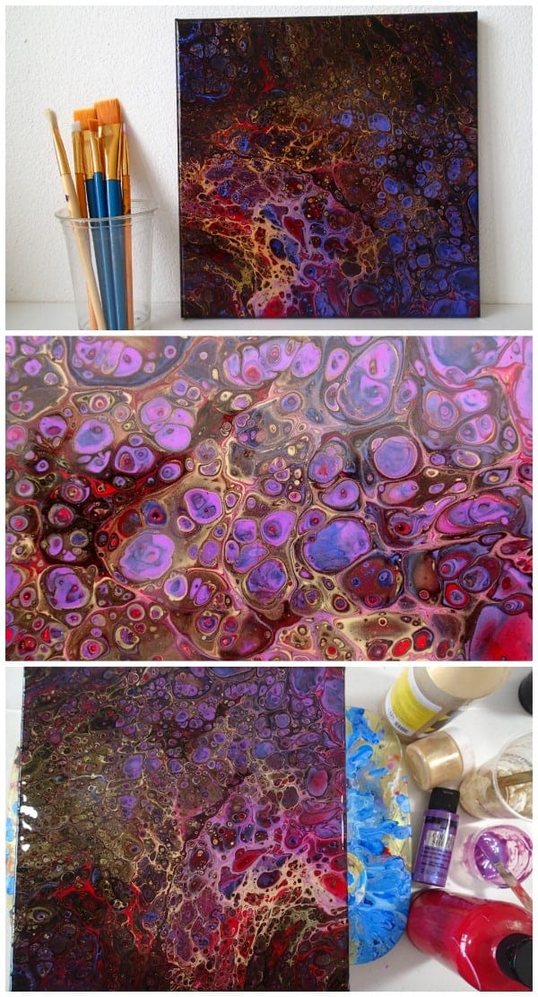
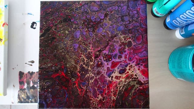
Do you feel that black is hard to work with? For me, it’s the clean up that puts me off using too much of it. Wiping up spilled white paint feels like a breeze compared to trying to clean up the same amount of spilled paint which has black in it. It just spreads everywhere, takes so much wiping, feels ‘dirty’ when it gets on my hands. But I still love the dark, rich colors and so black was the obvious choice as the base for this Color Shift painting.
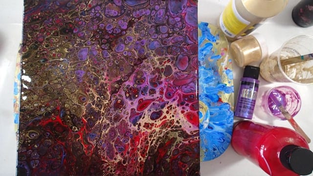
Colors used:
- Art Alternatives Gold and Black
- FolkArt Color Shift in Purple Flash
- Blick Acrylics in Bright Red
- A sprinkle of gold mica in the gold paint
- Floetrol– at about 50% of the paint by volume
- Coconut Milk dimethicone oil
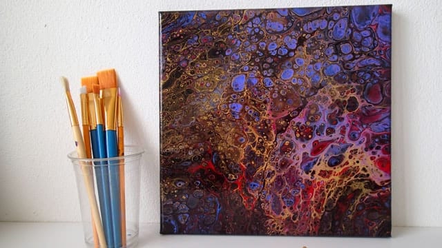
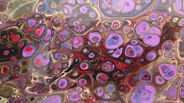
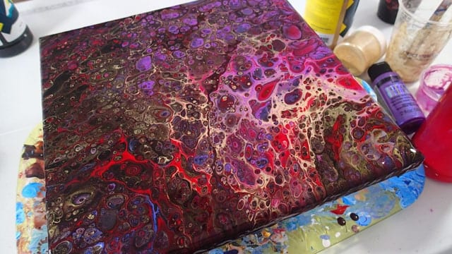
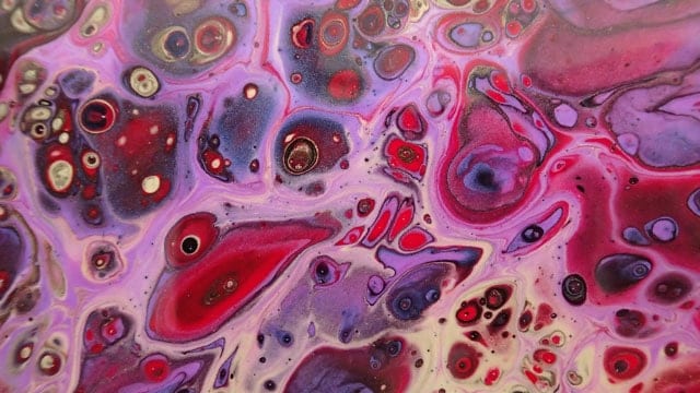
This was my first real pour using the Coconut Milk in place of my usual treadmill belt lubricant. I’ve tested them out before, but was keen to see how it would work in a real pour. It did well! I didn’t torch this painting at all but it’s covered in an explosion of cells right out of the cup and they just kept on coming as I tilted the canvas. So this painting is covered with cells within cells.
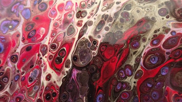
From far away, this painting might not be too striking, but close-up where you can see all the sparkle of the metallics, the color shift iridescence and all the details of the cells and the gold veins – it’s pretty spectacular I think. One of my all-time favorites.
Veining with Color Shift
Color Shift is also great for delicate embellishments to enhance your piece. Take a small amount of Color Shift and a very thin paint brush, and try outlining parts of your pours. You may not even notice the lines when looking directly at the painting, but when you move to the side of it, that quick flash will add a big bang.
Color Combination Inspiration for Color Shift Paints
Some of my favorite color combos:
- Color Shift in Red Flash
- Gold (any brand)
- Black (any brand)
- Color Shift in Teal Flash
- White (any brand)
- Navy (any brand)
- Color Shift in Black Flash
- Silver Metallic (any brand)
- Aqua or Teal Flash
- Color Shift in Yellow Flash
- Color Shift in Emerald Flash
- White (any brand)

After being told in high school that she was so bad at art that she should switch to another subject, Deby didn’t paint again for 35 years. Then a stroke released a new wave of creativity and she began exploring with dot painting, abstract and eventually acrylic pouring, and at last the joy of working with color returned. You don’t need ‘talent’ to be an acrylic pouring artist – just enthusiasm, some basic instruction, and a willingness to try, fail and try again. Paint along with her and learn from her many mistakes, and you’ll soon make great art together.