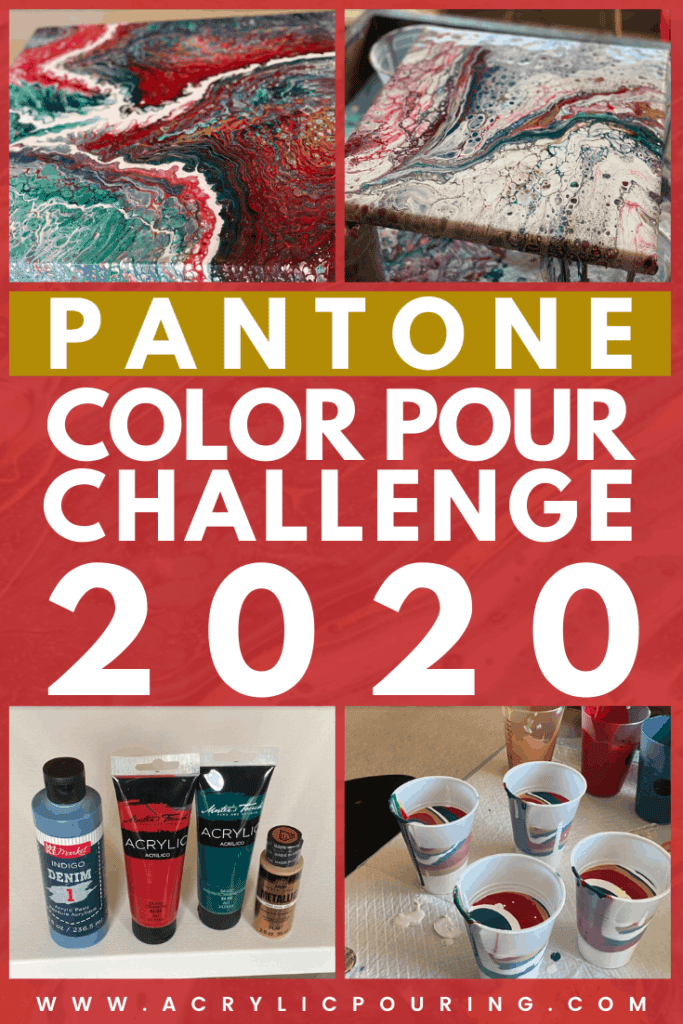
If you’re like me, so often I get a creative spark within me. I get all excited, unwrap the canvas, set up the stands, pull down and shake up the bottle of floetrol and then; the question of the day… What colors should I use?
In my 20 years of construction management, I’ve worked with many interior designers and in the process have learned they turn to the Pantone Matching System (PMS) when designing. The PMS is a series of colors which allow the design world to “color match.”
With every season and trend the creators of the world get together to generate beautiful color trend pallets.These pallets are beautiful color combinations that help creators create. Back to my blank canvas…
I wanted to challenge myself to produce something with colors I don’t typically use and thought, what a great way to start off 2020, by looking up the color trends for the season and use them in my pour! The pallet I selected came from Terrago, a designer of leather products. I used their 2020 Winter color palette.
I wanted to stay as close to the pallet as possible but still use something that would represent my style, so I decided to use at least one metallic paint. The rest of the paints came from what I already had in stock. I also wanted to try at least two different techniques to see if there would be drastic results using the same pallet of colors.
For both pours, my pouring medium was the same; two parts Floetrol to one part house paint.
My base was also the same; one part white flow acrylic with three parts pouring medium.
Supplies I Used:
- Masters Touch Crimson & Phthalocyanine Green
- Folk Art Metallic Royal Gold
- Make Market Indigo Denim
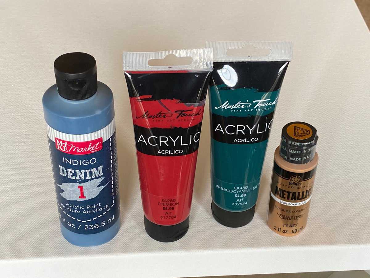
No silicone was added to any of the paints.
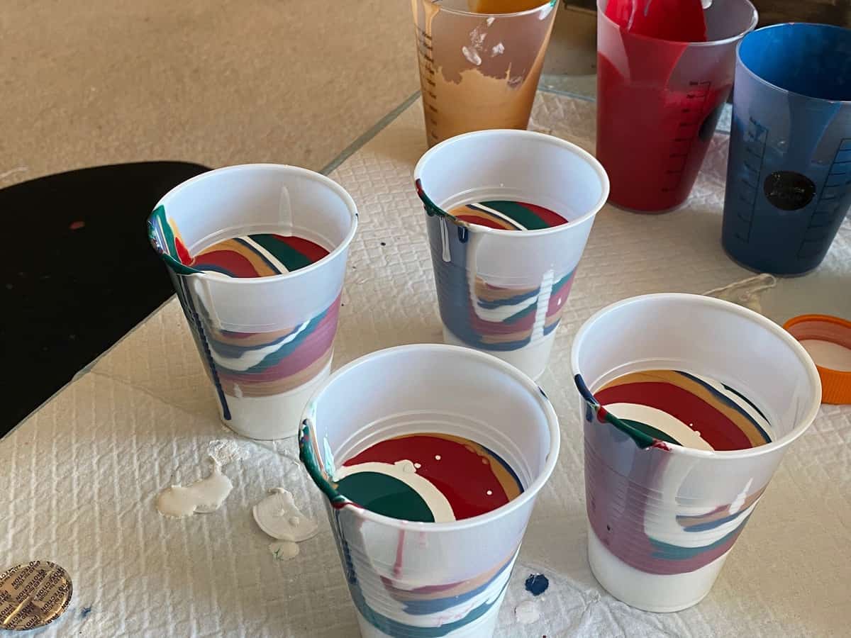
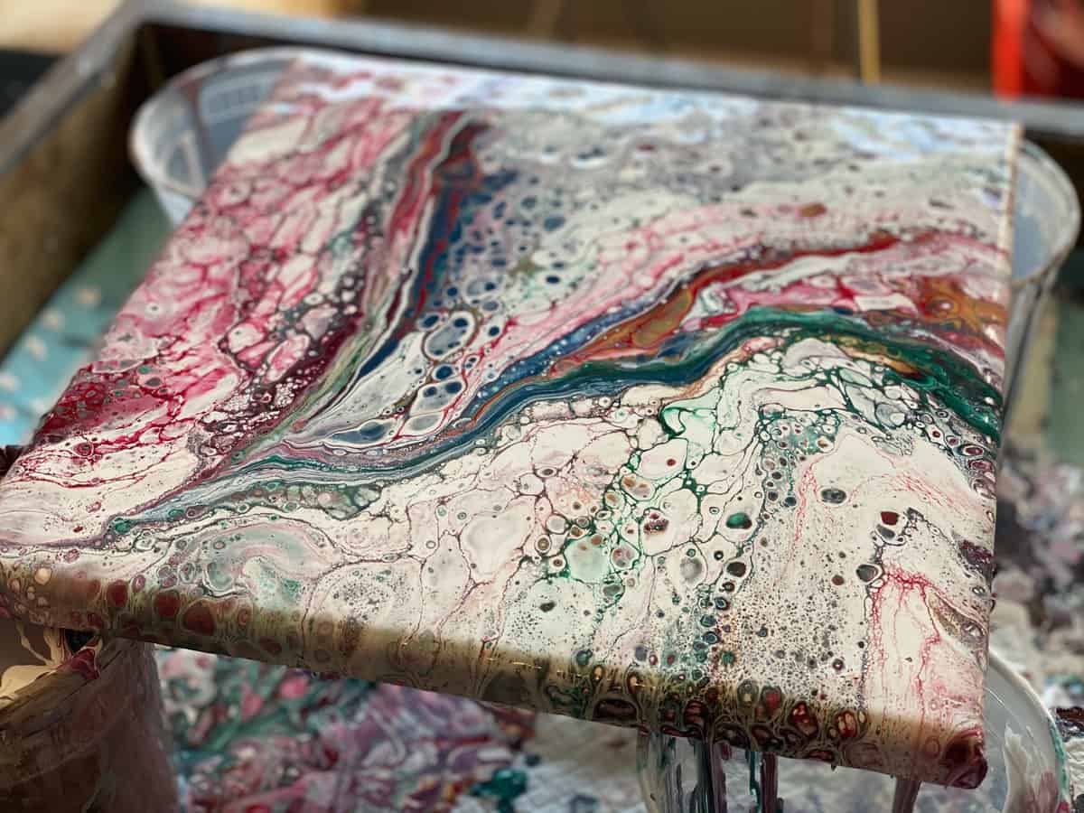
The first pour I did was a four cup ring pour. I layered each cup differently but started all of them with white. I poured four small rings in each quadrant of the canvas, then tilted. I loved the result but the red and green overpowered the metallic gold. I think the metallic was a little thinner than it should have been. Still happy with the result.
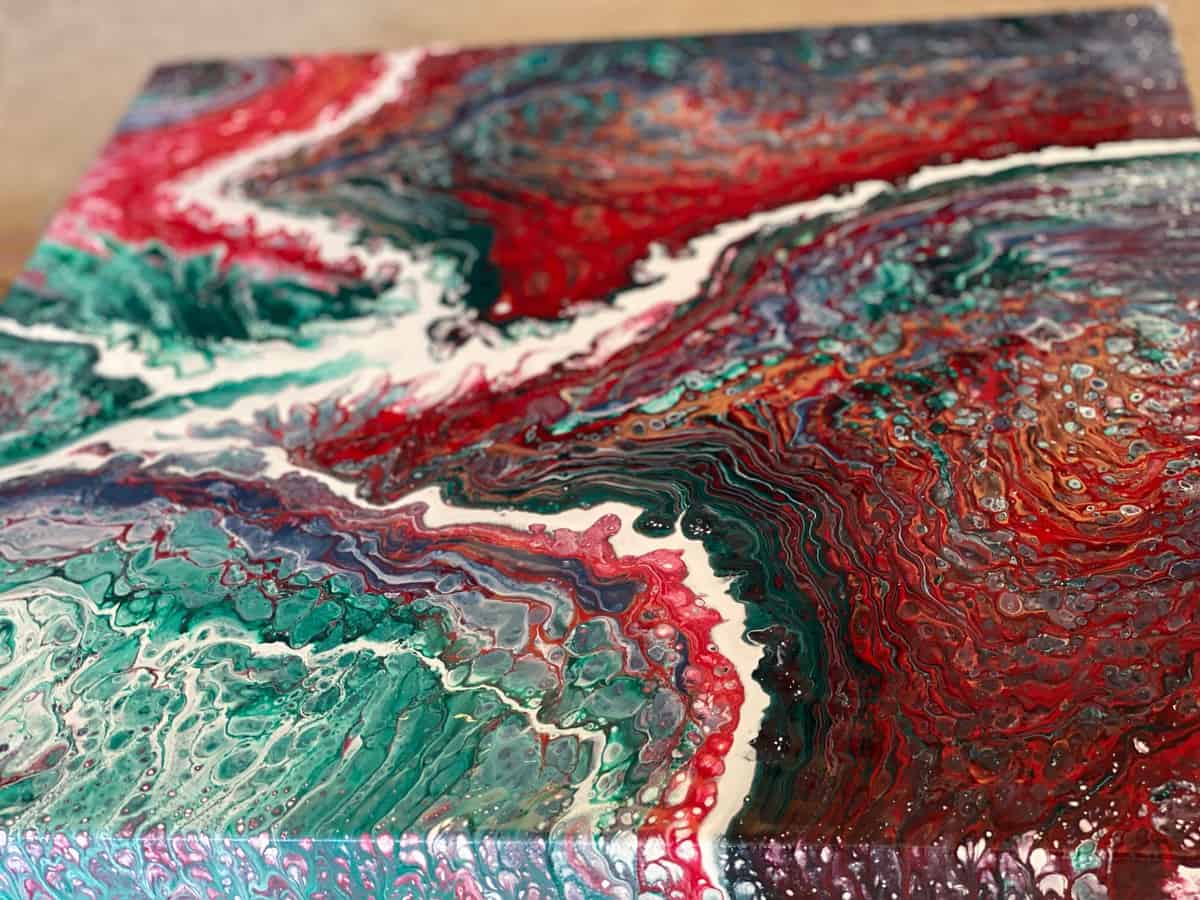
The second challenge started off as a swipe. I used the remaining paint to make stripes on the canvas and swiped with white but with no silicone, it wasn’t quite right. I chose to scrape the canvas and did a flip cup by layering the colors again in two cups with white at the top and the bottom. I’m so glad I did. I loved the result. I got some nice lacing and the gold pokes through just enough to make a statement.
Now, it’s your turn.
Here’s your challenge. Using this same pallet (Terrago Winter Pallet) or an established color pallet (Google “2020 Color Trend”), create two different paintings using the same pouring medium, the same paints, and two different techniques.
Here’s some links to popular pallets you can use:
Pantone Color of the Year Pallets
If you want regular pallet inspiration you should go follow AWSM on instagram. They post different palettes constantly and you can go back and get some inspiration there.
Once you create your pour come back here and submit it to the Experimenting With Colors Photo Contest.
Tips:
1. Don’t stress if you can’t find the exact color. You can always mix a few colors together to come up with the colors in the pallet. Remember to mix the paints before adding the medium.
2. If you’re using metallics, you may have to adjust your ratio of pouring medium because they tend to be a little thinner than most acrylic paints.

My name is Lisa; My husband Tim and I have been married for over 30 years. Together we have 3 wonderful adult children. By day I am a Construction Project Manager, by evening a professional hobbyist (I made that title up). In my spare time and when I’m not spending time with the kiddos you can find me dabbling in all sorts of creative mediums and projects. As a result, and because I can’t keep it all, for the last 5 years I have had a fun time moving some of my art and unique gifts through my Esty shop (My Sister Creates). It has been a great outlet that allows me to be creative and share that creativity with friends and family. Most recently however, I have fallen in love with acrylic pour painting on canvas which is most of the art you’ll see here today. My hope is that you will find the perfect work of art to display on the perfect wall in your home or office. Even more so, my hope is that as you walk through the gallery, you would take some time to read the stories attached to each setting of paintings. I pray that your heart is moved but mostly that you would know you are loved by the most perfect creator, Jesus.

