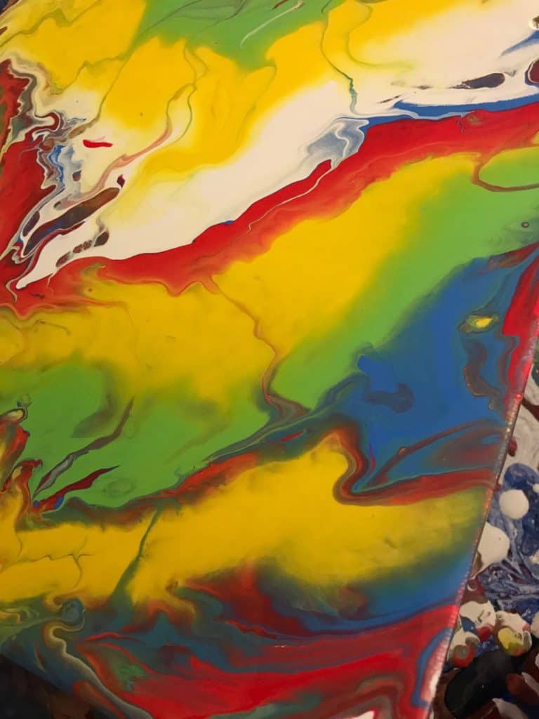
I don’t usually gravitate toward traditional colors, it’s rare that I’ll use more than one primary color in a pour. But this week, as I was walking through the paint aisle of the craft store I found several colors that were just really doing it for me. And yes, I do realize that green is not a primary color, but it’s just such a pretty shade.
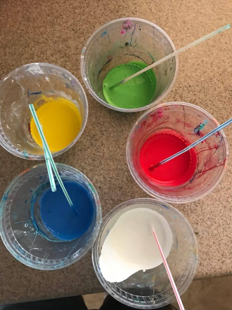
Supplies I Used:
- DecoArt Americana in Cool White, Bright Yellow, Bright Green, Bright Blue, and Red Alert
- Canvas
- Plastic Cups
- Plastic straws
- Toothpick
Maybe it’s because it was such a classic combination of colors or the vibrancy, but this simple scheme was really exciting to me. But because I’m me, I’ve always got to do something a little out of the box. A few weeks ago I did a little tie-dye project with some friends and wondered if I could recreate that blurred edge effect with air manipulation and the right kind of pour technique, since I was already experimenting with these innocent colors I decided to double down and give in to my experimentation temptation.
For what I was picturing in my head I thought a puddle pour would be my best bet. Part of my inspiration came from a puddle pour video I saw on this blog a while ago by Deborah Dougherty, her Kaleidoscope pour. I thought the way she created the lines within the puddles would help to create those blurred tie-dye lines. I’d never done many puddle pours and I knew I would risk some muddy colors if I layered my paints wrong so I tried my best to keep color theory in mind while pouring
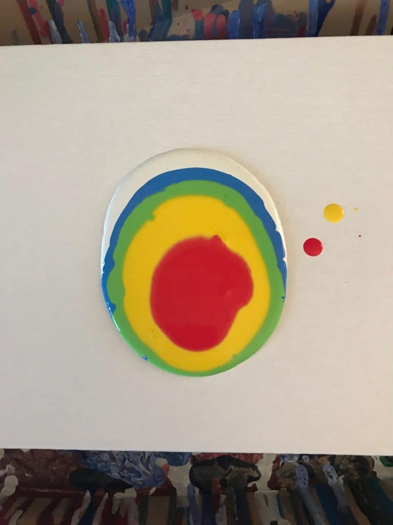
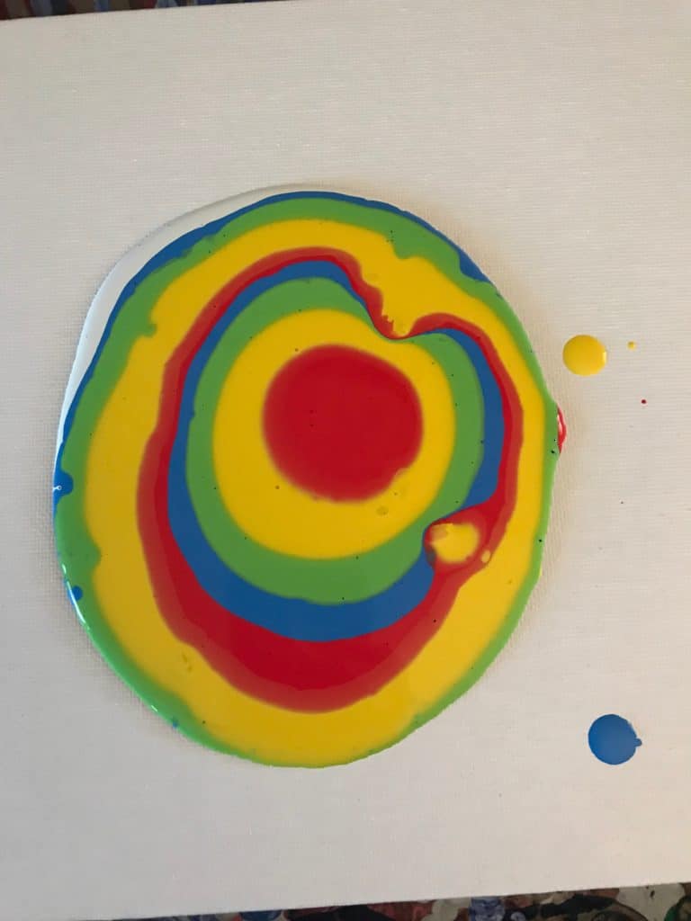
I really loved the little blob I created and thought for a minute that I should just keep adding to it until it took over the whole canvas, but I’ll save that for another pour. I was on a mission! With my tooth pick I started to drag lines from the center of the blob all the way through to the blank parts of the canvas.
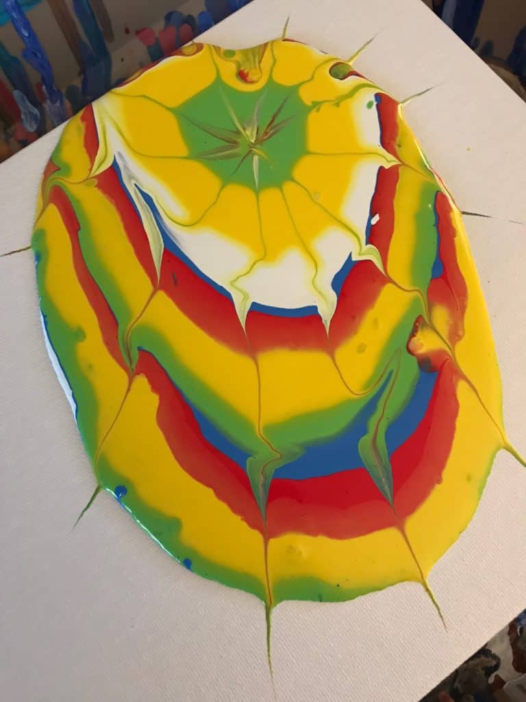
From there I took my straw and started to blow gently on the edges of the paint as well as the lines I’d created to make that blurry tie-dye effect. I added a bit more paint to my puddle and drew some extra lines, used my straw a bit more and then started to tilt to cover the rest of the canvas.
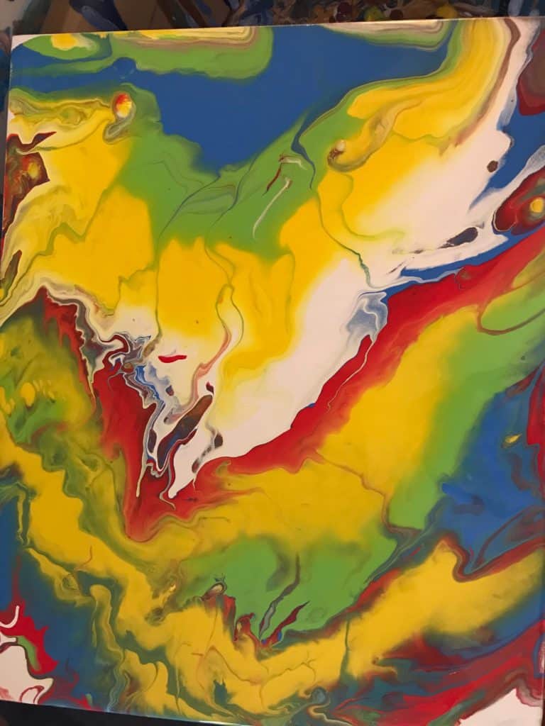
While it isn’t exactly what I had envisioned when I started this pour, I’ve got to say, I am really excited about what I got. I managed to avoid mud and got a lot of interesting color combinations with all these bright, fun colors. The little lines that run through the puddle are a new look in a pour that I think is something I’ll be employing in different pours in the future.
I’ll definitely be trying this again, maybe with slightly runnier paint consistency or a different tactic for air manipulation. I’ll also be giving primary colors more of a fair shake from now on when it comes to choosing my color schemes.
PS Koz is new to the acrylic pouring game but she’s diving right in and has no intentions of looking back! A student of the universe, there is nothing this artist loves more than learning and trying new things. Her other hobbies include reading, foreign language, and salsa dancing.

