When I was younger I was very into collages. I would make them for everything I loved, bands, horses, flowers, I was a fiend with a glue stick. Recently, I noticed that collages have made a bit of a comeback in the adult world, but now we call them vision boards. I saw a friend’s vision board on her fridge and felt a rush of nostalgia for those glued up poster boards and I wondered how something like that could work with paint. Suddenly, my childhood and my adult world were colliding.
To create an acrylic pouring collage you will simply layer different pours on top of each other or on different parts of the canvas. You can use different colors and techniques for each portion. This allows you to create a more layered and distinct piece of work with less flow between colors. It’s perfect for improving contrast and making something different.
Supplies I Used:
- Artist’s Loft in violet
- Canvas
- DecoArt Americana in alizarin crimson and royal fuschia
- Artist’s Loft in titanium white and turquoise
- Artist’s Loft in turquoise, violet
- Americana acrylic paint in royal fuchsia
- Artist’s Loft in orange
- Folk Art in antique gold and rose gold
- Artist’s Loft in titanium white, emerald
- Elmer’s glue
- Water
- Rubbing alcohol
- Plastic cups and straws
The last pour I did has plenty of room for more paint and the pattern I created I loved so I decided to build from there. I took a look through my paint stores and tried to find a collection of colors that I don’t usually use but would work together and work with the colors already on the canvas. I settled on a warm color scheme with a little pop of silver to continue with my recent love of a touch of metallics. Because I was using pink and red I wanted to layer my colors so those didn’t just run together and become a hot pink. I decided to go with a classic flip cup this time, since getting back to basics was the name of this game.
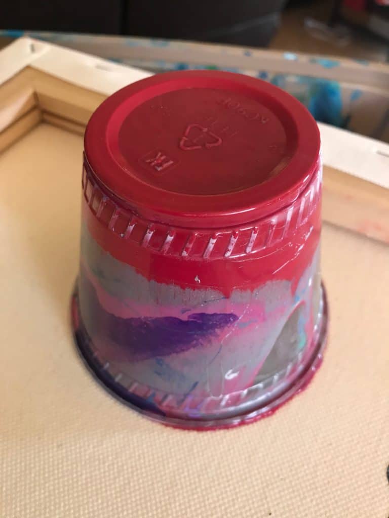
I wanted to give my past pour enough space that it wouldn’t be covered but close enough that I could start to fill up the canvas. When I first lifted the cup it looked like the purple had been totally buried under my layers of purple. With some tilting I managed to get the purple to come through and fill up nearly the entire corner. The big clusters of silver that were on top of everything during that initial flip started to blend in to everything else once the tilting started, which was good because I wanted it as more of accent than a prominent color. I got some really cool ripples of the pink and red mixed in with the silver that.
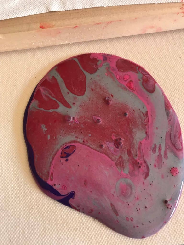
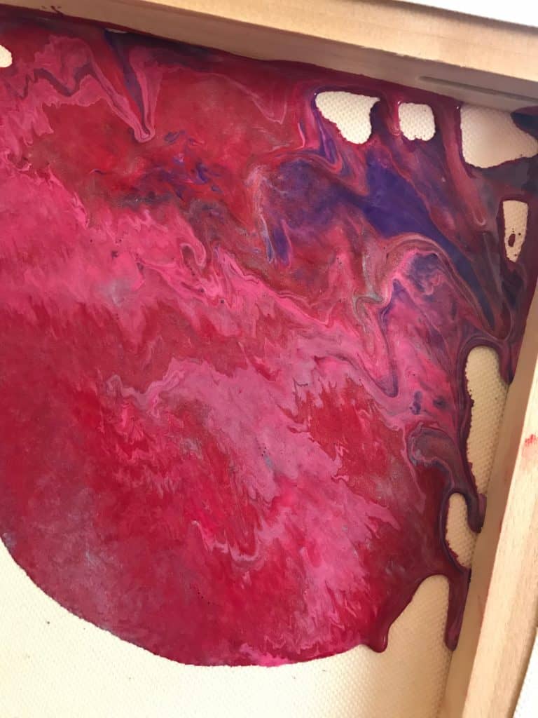
I wanted to leave some gaps for future pours because I think I’m going to have a lot of fun with this long term project, and it’s a great chance to practice techniques. Time to start dreaming up some new color schemes to go into my next step of the collage!
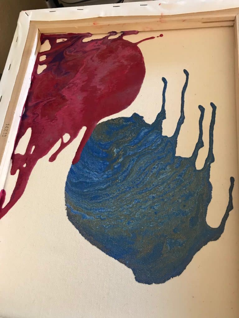
Looking at my acrylic collage after it dried I realized I was using primarily dark colors, there was a lot of angst on this canvas. I wanted to brighten things up but I’m not a huge fan of a lot of traditionally cheery colors (yellows, oranges, you know, sunny colors) so I went back to some of my past pours and tried to draw color inspiration from there. I picked up one of my favorite pours, my diamond in the sky, and knew that I’d found my answer.
I had learned from my last few mistakes of getting those icky little lines from improper tilting so this time I didn’t use the entire contents of my pour cup or the constituent colors so I could better manipulate where my paint would go by kind of finger painting a trail on. Because the name of this game was to actually cover my gaps I got a little crazy when it came time to actually pour. I did a tree ring wrist motion but didn’t keep my hand still, so I kind of tree ringed in long lines. Basically, I made one big curly along the biggest blanks.
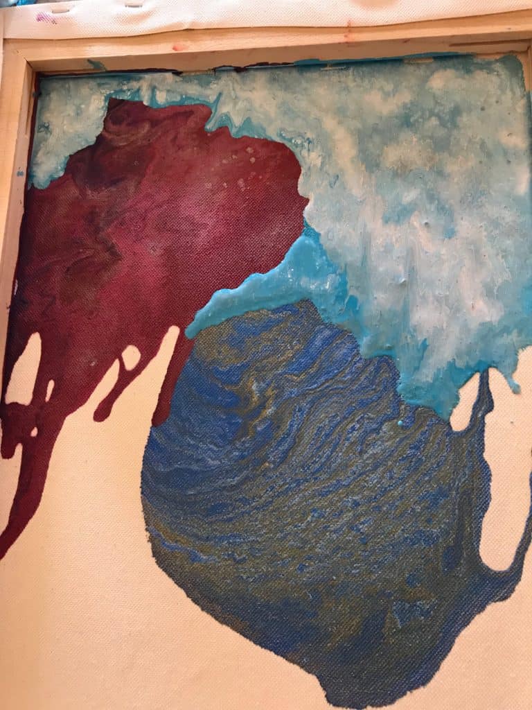
The more I stretched things the happier I became with my little sunny sky, and the more it started to look like a sunny sky since it was at the very top of my collage. It covered up all of my big gaps and still let the best parts of the past pours in tact. I am very excited about this project and where it’s going to take me as far as technique and color practice goes. And even if I make several missteps and can’t save it with another sunny sky it will have at least been a great way to practice what to do and what not to dot. Maybe if I’m smart enough I can really put who I am as an artist onto one canvas, the whole messy, unconventional, slightly erratic story!
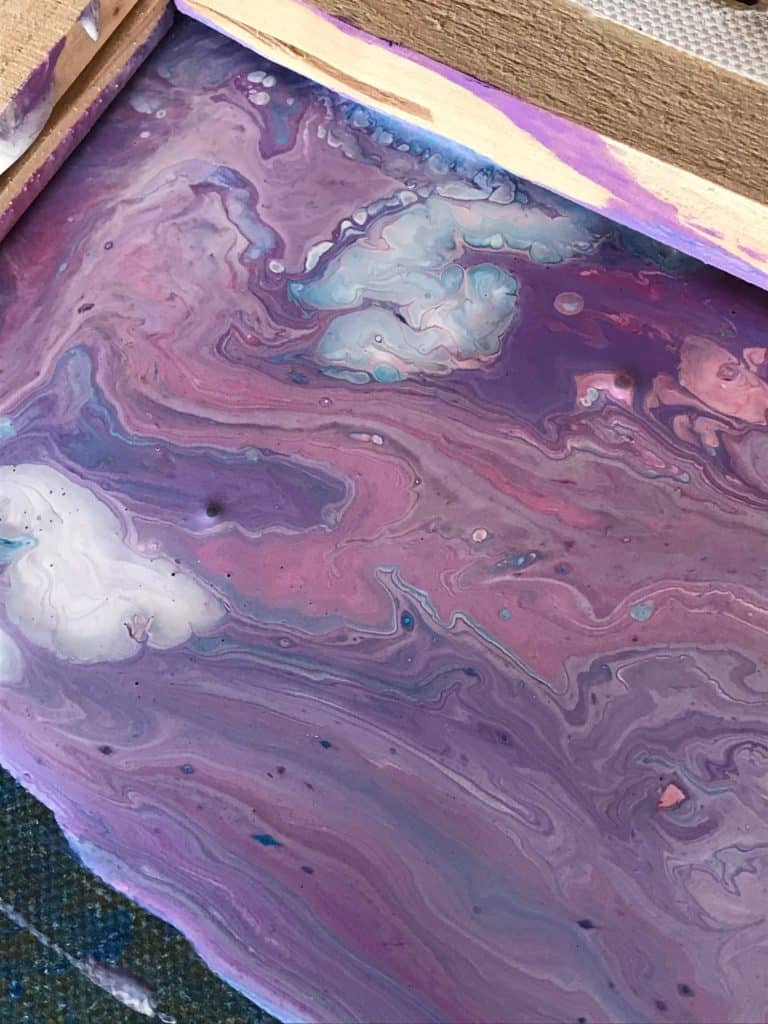
I really loved this purple that I mixed up with some violet and white so I wanted that to be the focus and decided it should be my swipe color. I added alcohol to all of these colors to promote some cells in the swipe, just a splash. This was a multi-swipe effort, the first attempt was a lot of purple, even after some tilting. So I decided to put a bit of white at the top, in the middle of my purple swipe stripe at the top of the canvas and drag that down. Let me tell you, that’s when things really got cookin’.
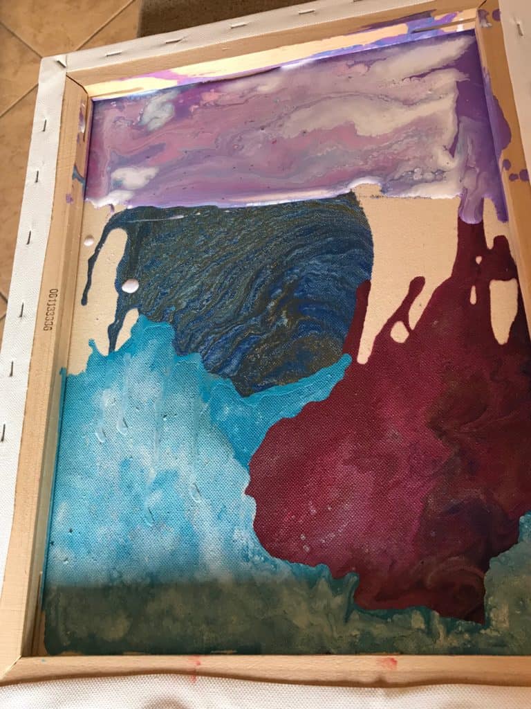
I’ve mentioned my aversion to orange and yellow in the past, they’re just not my thing. But sometimes art is about stepping outside of your comfort zone. This pour was one of those times. My acrylic collage was beginning to feel a bit one note, all cool, deep colors, it was lacking the pop it needed.
I went around for some inspiration, checked the internet, took some walks, sorted through my paint stores. The only orange I had was a bit too vibrant, very in your face, and I feared it would overpower everything else. I obviously couldn’t add some black to it to tone down the color, so I went with a splash of some deep red I had from a previous pour. That really did the trick of mellowing it out but maintaining the pop I was looking for. I decided to do a little puddle pour with my new and improved orange and some metallics.
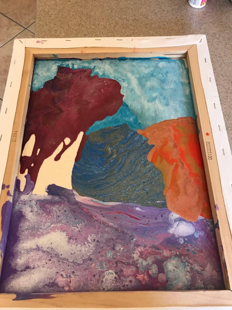
I only have one shade of green so I knew I needed to get creative to keep the color depth in this pour. I lightened up my green with a little white and added in one of my old turquoise colors. I lightened up my medium green into a pretty spring green that did a great job of creating a middle ground between these two colors. I also wanted to make sure that the colors were balanced on the canvas. I had to fudge the rules of color theory a little but that little artist inside me felt good about this choice.
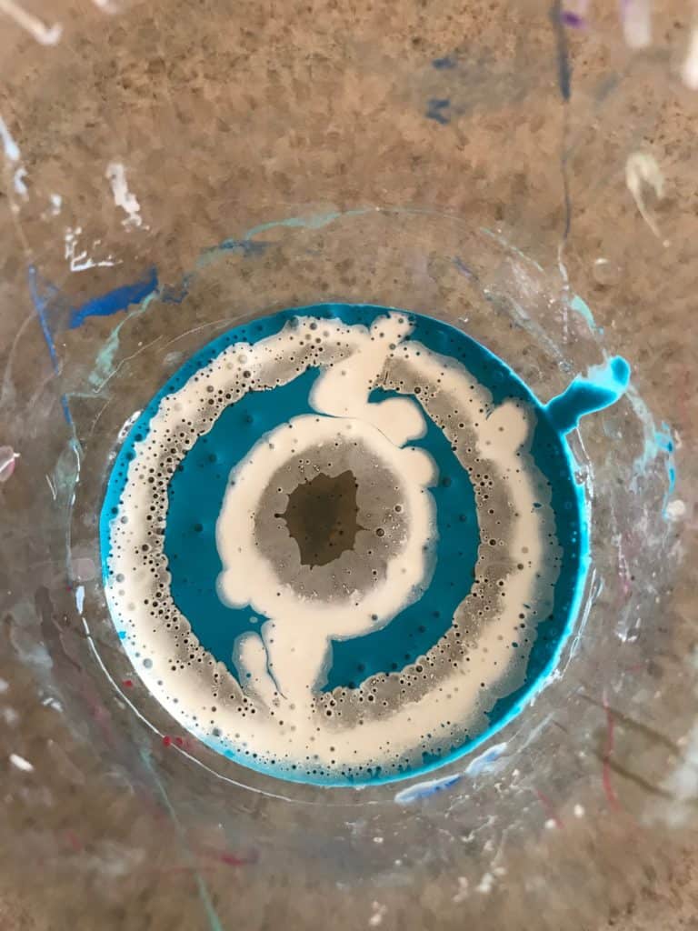
Because of the limited space I had to work with I went for a standard dirty pour. When I was mixing my cup I did plenty of layers because I wanted to be surprised with where my colors would land.
My paint was all of varying consistencies, part because of brand differences and part because of my limited resources, but it actually wound up creating a really cool cup. The waterier colors created quick paths for the thicker paints to follow and then they swirled together. Note to self: this could be a happy accident that could make for an interesting pour in the future.
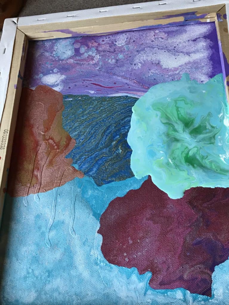
I am extremely pleased with how this collage turned out! It could have been—and at times I feared it would be—a huge mess but I somehow managed to get a big group of colors that are all happy living together. This is definitely something I’d like to try again in the future and would love to know if any of you have tried something like this!
Frequently Asked Questions About Acrylic Collage
1. Can I use mixed media in an acrylic collage?
Yes, incorporating different materials can add texture and interest to your collage.
2.Do I need to prepare the canvas before creating a collage?
Preparing the canvas with a base coat of gesso or acrylic paint can be helpful.
3.Can I use glue to adhere items to the collage?
Yes, a strong adhesive or medium is necessary to secure items to the canvas.
4.How do I seal my completed acrylic collage?
A clear sealant or varnish can be applied to protect your collage.
5.Can I incorporate photographs into my acrylic collage?
Yes, photographs can be included, but ensure they are securely adhered and sealed.
6.Is there a specific order to follow when adding elements to my collage?
There’s no strict order, but planning the layout and adhering background elements first can be helpful.
7.Can I create an acrylic collage on surfaces other than canvas?
Yes, acrylic collages can be created on various surfaces like wood, paper, or fabric.

PS Koz is new to the acrylic pouring game but she’s diving right in and has no intentions of looking back! A student of the universe, there is nothing this artist loves more than learning and trying new things. Her other hobbies include reading, foreign language, and salsa dancing.

why do you pour on the back of a canvas?
I’m thinking cheap experiment to see if you like it with another pour on the front side. Economical upcycle with no loss of extra canvasses
I’m not sure why the pour is on the underside of the canvas.
OK, you lost me. You’re pouring on the back of your canvas, so what’s the next step? Are you looking for the paint to show through on the front and you’re adding additional materials, or is this just to create skins to be used in a collage?