Have you ever made a good pour and then wondered what to do to make your pour great? Do you sometimes feel you know the technique to make a pour, but it doesn’t turn out as well as you hoped? Most of us have. Luckily, all it takes is a little extra knowledge and some practice to transform any good pour into a great piece of work. I want to share a few tips that I use to take my pours from “good” to a piece of art that I can sell for thousands of dollars.
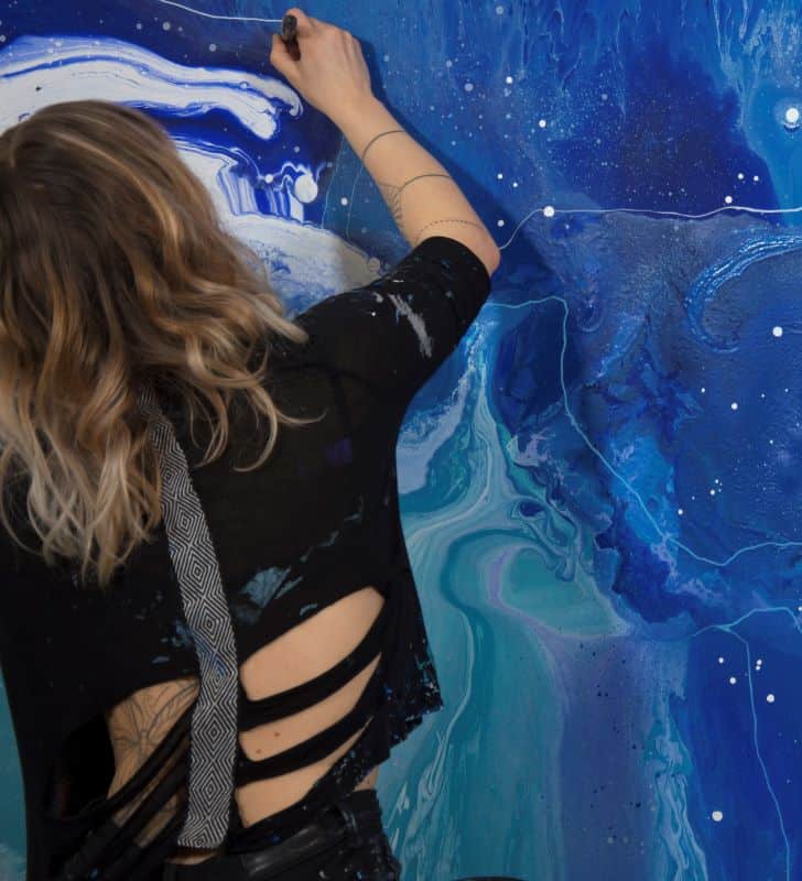
A New Perspective on Pouring
Before I share my three tips to transform your work, I need to help shift your perspective a bit. A fluid art piece doesn’t start and end when the paint is poured on the canvas. There’s actually a lot that can be done before and after the pour, and these are the details that make a big difference. For me, AFTER the pour is where the most interesting phase begins.
Understanding the whole pouring process takes some practice and time but the sooner you start thinking about it, the earlier you will start improving your art practice. Hopefully it will open new doors for you, and over time, you will be able to take your artistry to another level.
Even if fluid art is blissfully freer in terms of rules than most other genres, there are still things we can learn from more traditional art. Most humans tend to code visual impressions somewhat similar. It is not a coincident that some colors look good together for most of us, or that sunsets are considered beautiful.
What I have learned over the years are that there are three key components to consider when creating an artwork; the harmonization of colors, the composition and creating depth. Being aware of them, and implementing them to your artistry, can be the difference between a good and a brilliant piece of art.
#1. Harmonization of colors
When planning your artwork and choosing a color scheme for the painting, don’t look at the different colors you consider one by one. Colors relates to each other, for example, put a pink color next to a blue color and then put the pink next to orange. It is the same pink, but it will appear in a totally different way.
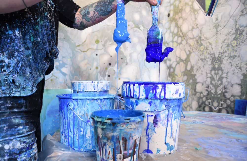
You do not need to learn everything about matching colors. The important thing is that you build up your intuition and practice. Look at other artwork, what do you think is a good match and what is not. Be aware and plan your color scheme before starting and with time you will find which color combinations work for you and give your artwork a harmonious appearance.
#2. Enhance the composition
The pouring process decides the movement and core composition of the artwork. This process is for most of us spontaneous and it is hard to say in advance exactly how it will turn out. Over the years I have learned to control this process to some extent and I usually have a good idea about how and where shapes and transitions will take place.
However, I believe the next phase, after the pour, is equally important. When the pour is done, I start looking for components in the composition that can be enhanced to make it more interesting. Usually I want to make certain movements more highlighted and create patterns to get a dynamic flow in the piece.
I usually do this in two steps:
- I create cells in different sizes and shapes in some areas to make some parts richer and more present.
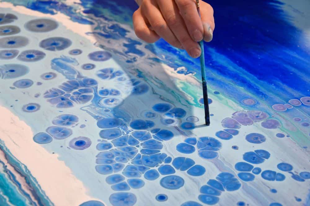
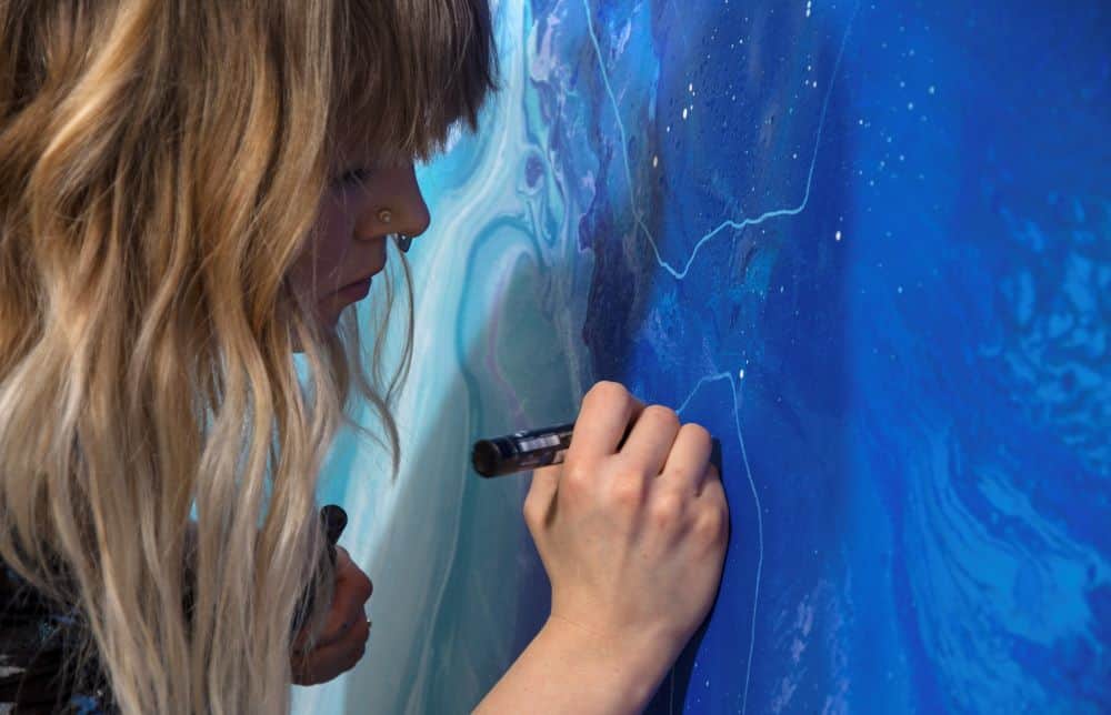
- When the paint is dry, I go over to make lines and dots, with a brush and acrylics, that draws the attention to the parts I want to highlight. This gives the movement in the artwork a new dimension and enhance the overall composition with a more dynamic impression.
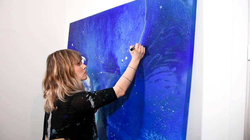 Creating lines after the pour
#3. Creating depth
In fluid art, you usually don’t have a motif with background and foreground that gives depth to the painting as in other art genres. If we want depth, which I believe make the painting more interesting, we must use other methods.
You can of course create a sense of depth with combining colors, but I think you have the best possibilities to do it after the pour is done and the paint is dry. I create depth in my painting by making some parts darker or muddier and some parts brighter. It gives a sense of dimensionality; this is best experienced if you squint at the painting with your eyes semi closed.
To do this I use spray paint and sponges. Using spray paint on certain areas create a fading effect, almost as a shadow. With a sponge and some light acrylics, you can create an effect of light in some areas without covering the underlying layer completely.
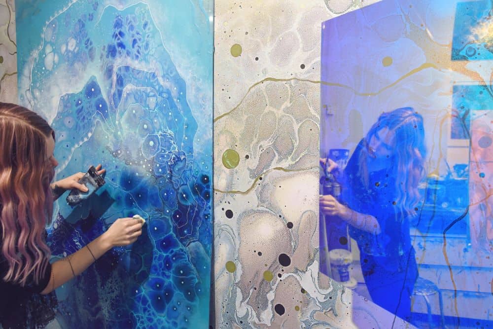 Using a sponge to add dimensionality
If you are looking to create professional paintings, I think these three things are something to consider. I spend a lot of time after the pour, experimenting with new ways of making details which enhance the artwork, by doing this, you can definitely take your artistry to a new level.
For those interested in getting step by step instruction on how I create professional level fluid art pieces check out my course here at Fluid Art Academy and get 30% off using the coupon code “acrylicpouring”. In this course I hold nothing back and show you exactly how you can take your work to another level by focusing on the composition before and after you pour the paint. I’ve also included a demo of me creating a whole painting from start to finish (which I’ve never revealed before) so you can see everything I do in action.
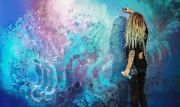
To be able to let go and just create, I have spent thousands of hours in my studio trying out and learning different techniques. I started from nothing but love for fluid art. I have tried every technique imaginable to figure out which works the best. Now I want to help other artists and the general fluid art community by teaching what I have learned, so that everyone else doesn’t have to spend all those years trying all those things that doesn’t quite work as well. Instead I hope that those who take my course “How to Paint Fluid Art” will learn all the important techniques so that they can use them to express their own inner art passion.

I know different types if pouring, but I am told ” they are all starting to look the same”. Different colors, different types of pouring but results are the same. When I first started before I knew anything, I had some awesome things. Now I have no idea how I did them.
It’s a phase many fluid artists goes through, the solution is different for everyone. Maybe you need to focus less on techniques and more on emotions and what really inspires you!
I have done pours for the last several years. Iam just wondering if most of this course is about technique and mixing paints and the dif ways like dirty pour, colander, swipe ect or will it be more involved than that.
The course is a lot about demonstrating and explaining techniques, but the actual pouring is only a small part of it. It’s more about how to make cells, lines, dots etc. Both in a demonstrating way but also the theory behind it.
Thank you!
I’m a Uni trained “old school” artist from the 80’s. I too “enhance” my pours n many ways the same as you. I just can’t help but see the deeper soul of a piece shouting out “come find me”.
I find my pieces become more like abstract formations. For instance, with shades of browns & greys, I turned a piece into what peeps said reminds them of “abstract piece of the Grand Canyon”. I spent more time enhancing that piece than when I first poured it.
To me as a professional artist, I am more confident that I can call it artwork. Just my POV. And I’m happier with this!
So thank you for your article as it helps me feel better about my approach! You’re doing beautiful work! KEEP IT UP!!
Thank you so much, that’s great to hear!
What am I doing wrong? I cannot make cells no matter how carefully I measure the paint, medium, silicone and demineralised water. I have tried various recipes using Floetrol, Glue-All, Isopropyl and Holcroft pouring medium . I always blow torch after. Sometimes I may get tiny cells in just one corner of the pour/canvas. I use Mont Mart, Global and Eraldo di Paolo quality paints. ??
Cells can be frustrating! I have spent years developing my way of creating them. There is a large part about it in the course explaining how I do it which is a different and, in my opinion, easier way than the examples you’ve been working with. I hope you find a way to make it work!
Watching your Introduction on the website, the first thing that strikes me is there’s no subtitles.
There’s no subtitles as it felt more important to keep the whole frame for the video images. But the course is not video only, each chapter is explained in text as well to assist with all explanations. Hope this helps!
As Geoff says, there are no subtitles in the introduction video. Will there be any in the course videos? The sound track is difficult to follow.
There’s no subtitles as it felt more important to keep the whole frame for the video images. But the course is not video only, each chapter is explained in text as well assist with all explanations. Hope this helps!
It’s slightly worrying, Emma, that you don’t seem to consider it important to explain what is happening on the video – beyond the visual.
If you think subtitling is unnecessary, why do voice-overs on the video (I can only assume you talk through what is being shown).
Fret not, Emma – I shall not be buying.
That’s fine Geoff 🙂
There is verbal explanations in the videos (both voice overs and direct to the camera), and the written parts of the course explains everything in detail.
Chuckles…
“voice overs” – hence the need for subtitles for those of us who are deaf……
Happy days Emma – be safe.
I did buy the course and am hugely disappointed with it. The very name – Fluid Art “Academy” led me to believe there would be some sort of interaction between the student and teacher, but there’s nothing, not even an email contact for questions. There’s just a few answers to mainly generic questions. There is hardly any indepth stuff at all, the videos for the main are very, very short. Tbh watching someone literally mix paint in a tub for 3 minutes and being told depending on the paint brand depends how much PM and water to add doesn’t really say much, ditto saying that doing your own stretched canvas without saying anything at all about how to do it is pretty rubbish. There is hardly any detailed instruction at all, the biggest video is of Emma doing a painting but there’s no narrative just a mind numbing piece of music. This “course” is definitely not for a beginner, barely any troubleshooting or anything else. Emma’s work is beautiful but unfortunately the course falls far short of its promise, and I’ve got caught out as there’s nowhere to contact them.
I went through the course a few month ago and just started it again and I’m loving it! We must be so different Cherie! I felt I learned just what I needed to be able to experiment and continue learning on my own. And I sent questions to the email adress on the website and then I got detailed answers the day after.
Indeed Mary 🙂 I’m glad you found it useful, I think was vastly overpriced for what it was. I couldn’t find anywhere to send an email and I did look. Oh well, one lives and learns 🙂
are you painting on board or canvas?
On canvas.