
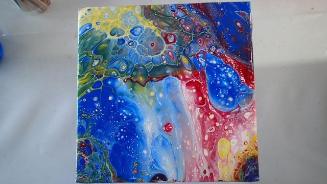
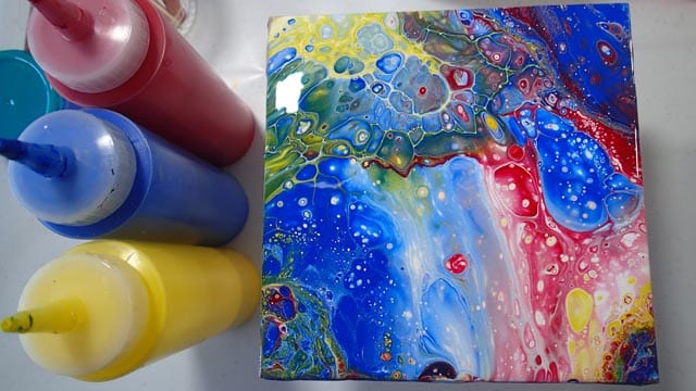
Primary colors have been my nemesis. I love bright colors, can’t get enough of it, so when my two previous pours with red, yellow and blue turned into something dark and gloomy I was SO disappointed. Both were scrapped.
Spinning a record with primary colors
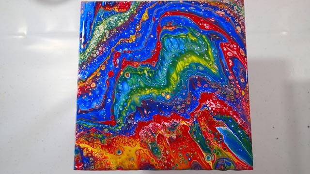
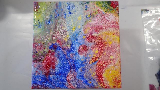
Primary color flip cup on a tile
But I’ve been practicing, over and over, Trying different things, seeing what worked and what didn’t work. The secret is in how the paints mix together – or rather how to prevent them mixing together too much. Red, yellow and blue when mixed all three, don’t make a nice color – more of a muddy brown which could fall more towards red, green or blue depending on how much of each color you added. Yes, I can confirm this from my earlier unsuccessful pours. Not good.


But mixing any two together makes a nice color – green, orange or purple. Just avoid mixing all three! Check out the video below for how I did both a flip cup and a dirty pour and avoided the mud, getting nice bright colors each time 🙂
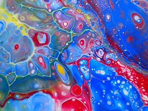
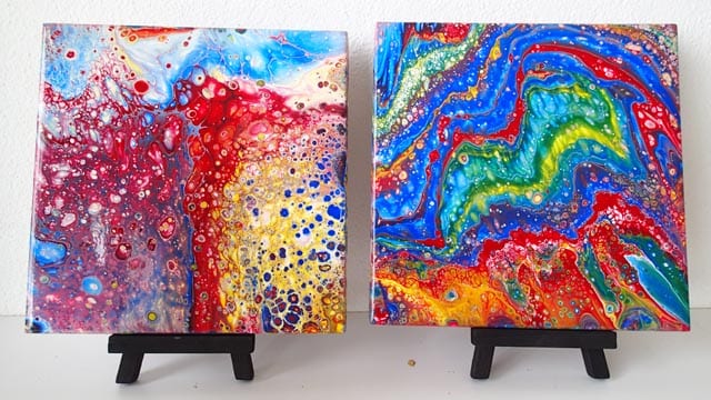
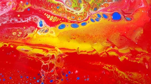
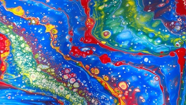
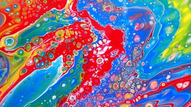
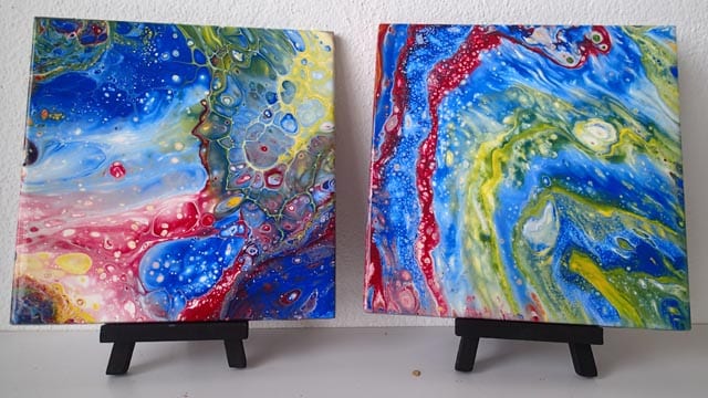
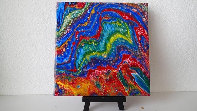
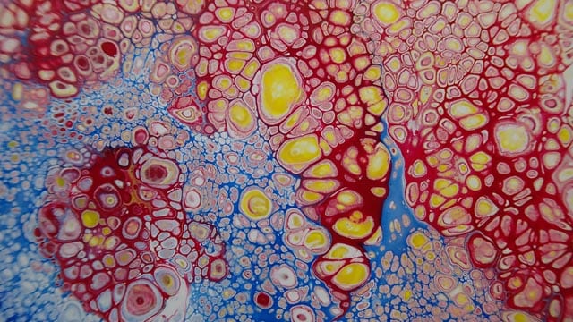
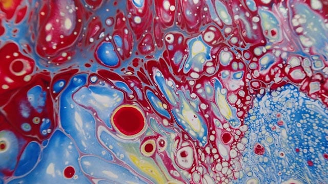
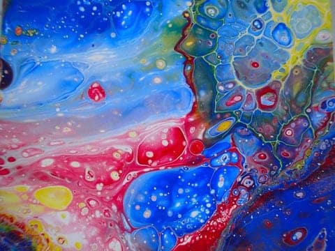
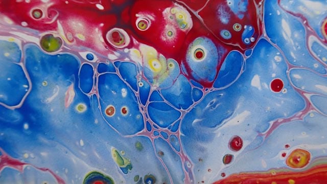
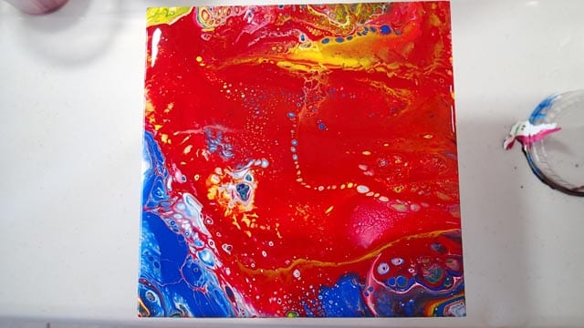
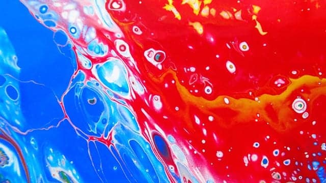
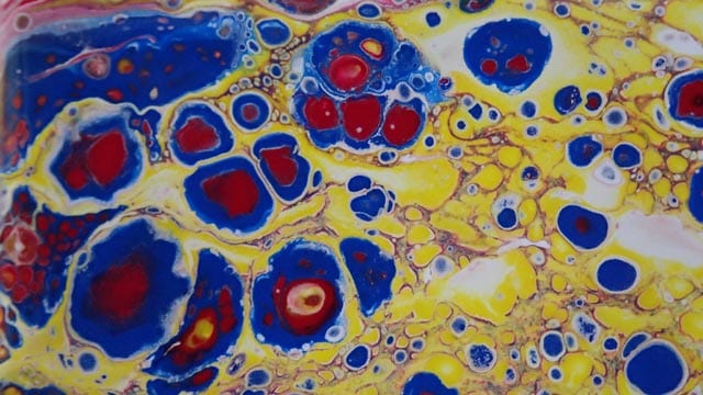
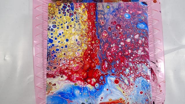
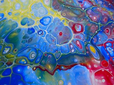
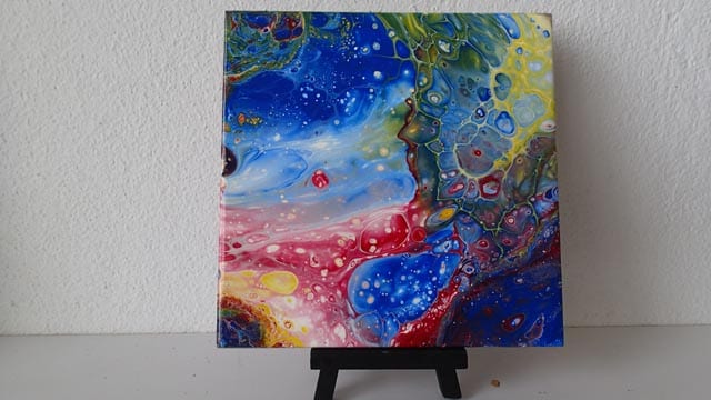
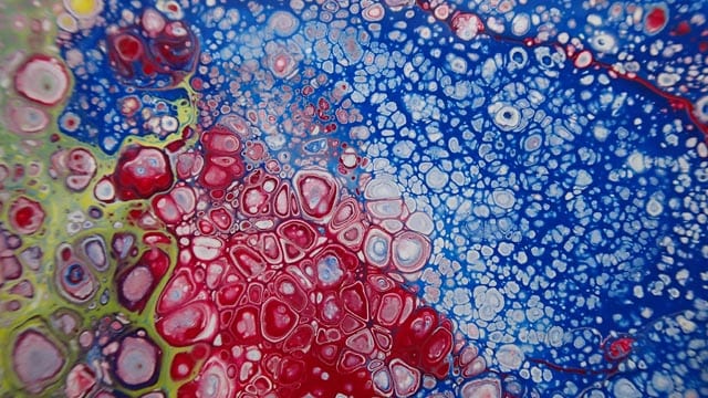
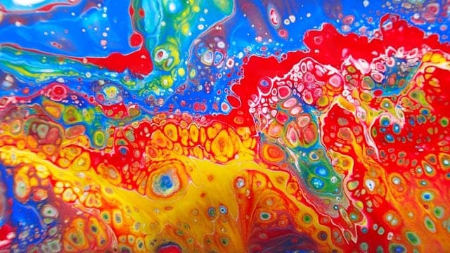
Now I have several really nice bright and happy examples that I am pleased with. OK, so primary colors might not be everyone’s idea of a nice painting, but I’m delighted. First, it makes me smile and second, I mastered a new skill.
Check out the slideshow below for lots more images of these successful primary color pours. Then go give it a try yourself – have some fun with color today.

After being told in high school that she was so bad at art that she should switch to another subject, Deby didn’t paint again for 35 years. Then a stroke released a new wave of creativity and she began exploring with dot painting, abstract and eventually acrylic pouring, and at last the joy of working with color returned. You don’t need ‘talent’ to be an acrylic pouring artist – just enthusiasm, some basic instruction, and a willingness to try, fail and try again. Paint along with her and learn from her many mistakes, and you’ll soon make great art together.