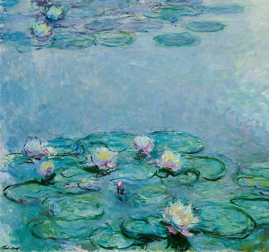
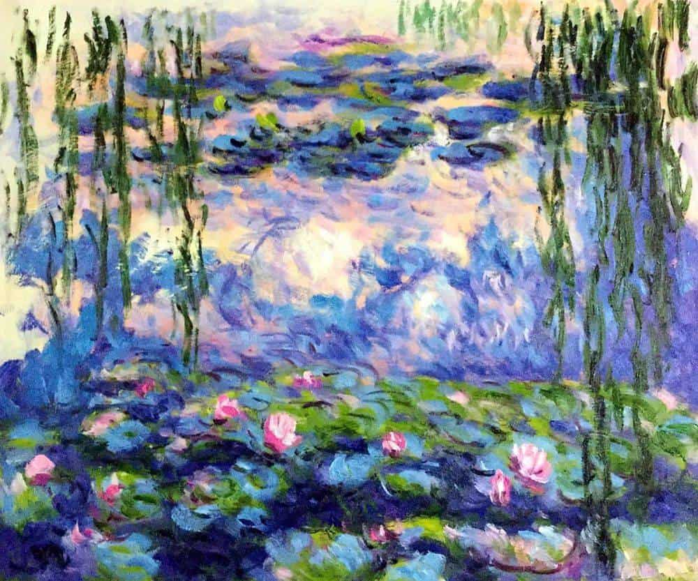
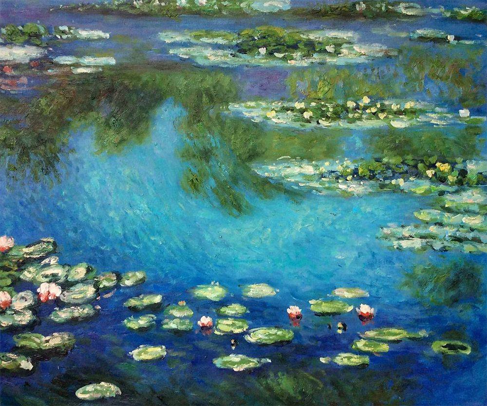
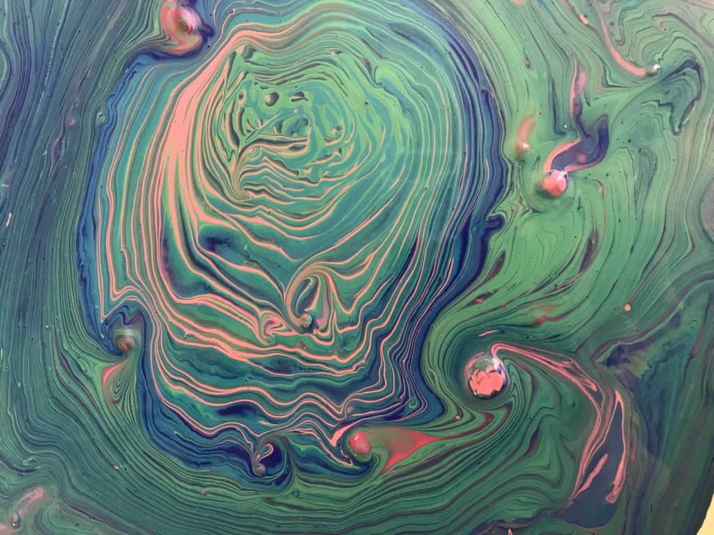
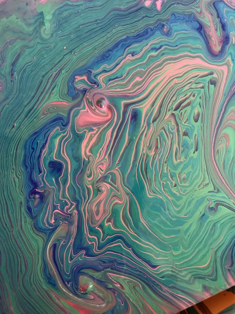
As some of you may know from a past pour of mine, sometimes I like to imitate the greats. Last time I tried to pour an imitation of Starry Night and wound up with something I liked quite a lot but almost certainly wouldn’t be labeled as a pour based on Van Gogh’s masterpiece by anyone who didn’t know me. Inspired by, definitely, but that’s where the similarities end. But here I am to try again, with a different artist!
Supplies I Used:
- Artist’s Loft in turquoise, titanium white, black, emerald green
- Americana acrylic paint in ultramarine blue and royal fuchsia
- Canvas
- Elmer’s glue
- Water
- Plastic cups and straws
Claude Monet is one of my very favorite artists, second probably only to Van Gogh. I love his use of color and the influence nature had over his works. I think like most people, my favorite series of his is Water Lilies. Tons of beautiful paintings of placid waters and bright, gorgeous flowers. I got to thinking about the calm nature of those paintings and how the brush strokes were light and almost mimicked cells from an acrylic pour.
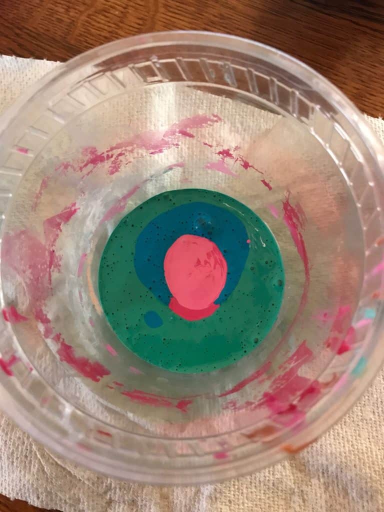
In the interest of growing as a pourer, as my resolutions outlined, I decided this would be the perfect pour to test out a tree ring pour. This technique requires steady hands with surgeon like precision and control, and because I’ve seen Grey’s Anatomy at least five times all the way through, I felt good about my chances. I watched a couple of Deby Coles old videos to make sure I knew how to mix this cup and the right movement.
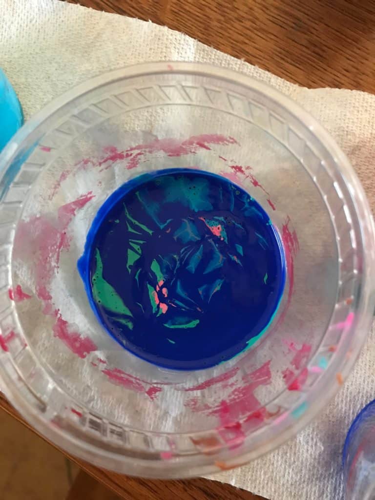
This cup required a lot of different mixtures and combinations to get colors that I thought looked enough like Monet’s color palette. And even after I started creating my mixed cup I changed a few colors, added some white to my pink, a bit more blue to my seafoam green concoction, and then I topped it all of with that blue I adore.
I gave my cup a little swizzle like I’d seen done during my homework and then I was ready to put paint to canvas. When I started the actual pouring bit of this project I felt too cool! I could see the rings coming out, the blues and greens were all working together as they would in a pond or a lake. It wasn’t until I got toward the bottom of the cup that I realized some of the pink paint wasn’t mixed thoroughly enough and I had some lumps, gah!
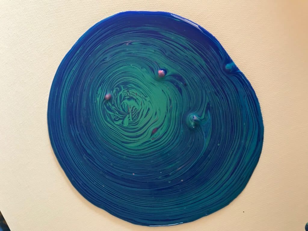
I looked at those lumps for a moment before realizing they actually looked a bit like little flowers on the surface of a body of water. These little buds of pink paint were peeking through the ripples of my paint puddle before giving way to the remainder of the pink paint that sank to the bottom of my cup.
This painting required some tilting because there wasn’t enough paint in my cup, I think if I attempt to imitate another set of water lilies I’ll use a round canvas. They just make more sense for this technique, I think! When I began tilting the seafoam and the pink started to appear more side by side which created more of a light pastel effect in the end, much like one of my sample pictures!
In all, I think this imitation was a much bigger success than when I took on Van Gogh and it was the first time I felt genuinely good about my first attempt at a new technique! I think I can confidently say, so far so good in 2019!

PS Koz is new to the acrylic pouring game but she’s diving right in and has no intentions of looking back! A student of the universe, there is nothing this artist loves more than learning and trying new things. Her other hobbies include reading, foreign language, and salsa dancing.

