Where did 2019 go? This year has positively flown by. It seems like just a minute ago, it was June. Except, that was half a year ago, and it definitely doesn’t feel like June in upstate New York.
In a few short weeks, something truly exciting will happen: we’ll begin a whole new decade. What are your resolutions? What are your goals? Every year is a new chance, but the beginning of 2020 seems like an especially good time to start churning towards whatever your dreams are as an artist.
A new year also means new trends in design, fashion, and general color preferences. So, without further ado, here are a few of the trends I’ve rounded up to help you create on-point pieces throughout 2020.
Pantone
Each year, I really look forward to Pantone’s Color of the Year! Pantone doesn’t just randomly choose a color either—they pick a color after really studying what the color means and what we, collectively, need.
This year, the Pantone Color of the Year is: Classic Blue!
Classic Blue might seem like an odd choice, but here’s what Executive Director of the Pantone Color Institute, Leatrice Eiseman, says about why it was chosen:
“We are living in a time that requires trust and faith. It is this kind of constancy and confidence that is expressed in PANTONE 19-4052 Classic Blue, a solid and dependable blue hue we can always rely on. Imbued with deep resonance, Classic Blue provides an anchoring foundation. A boundless blue evocative of the vast and infinite sky, Classic Blue encourages us to look beyond the obvious to expand our thinking; challenging us to think more deeply, increase our perspective and open the flow of communication.”
Blue is peaceful and simple—two things that are in short supply these days. It’s no wonder that Classic Blue will set the tone for trend this year.
How You Can Apply It
It looks like 2020 will feature a lot of bright, bold colors like Classic Blue! Jump in and mix those bold blues with stark whites for a poured study in shades of blue, or take a leap and combine bright blue and bright yellow in a tree-ring pour to really get a piece that pops!
Interior Design
According to CollectedInterior.com and Elle Decor, there are a few trends that will be leaving, and a few new ones to look forward to.
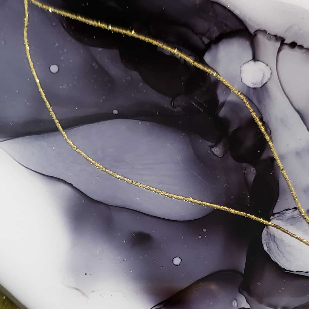
Black and White: Is there a color combination more elegant? The surface simplicity of using black and white is misleading: a black and white pour is nothing short of extravagant! Create depth with tree ring pours, or a faux marble with a flip cup. A drizzle of gold here and there will bring even more character to your piece.

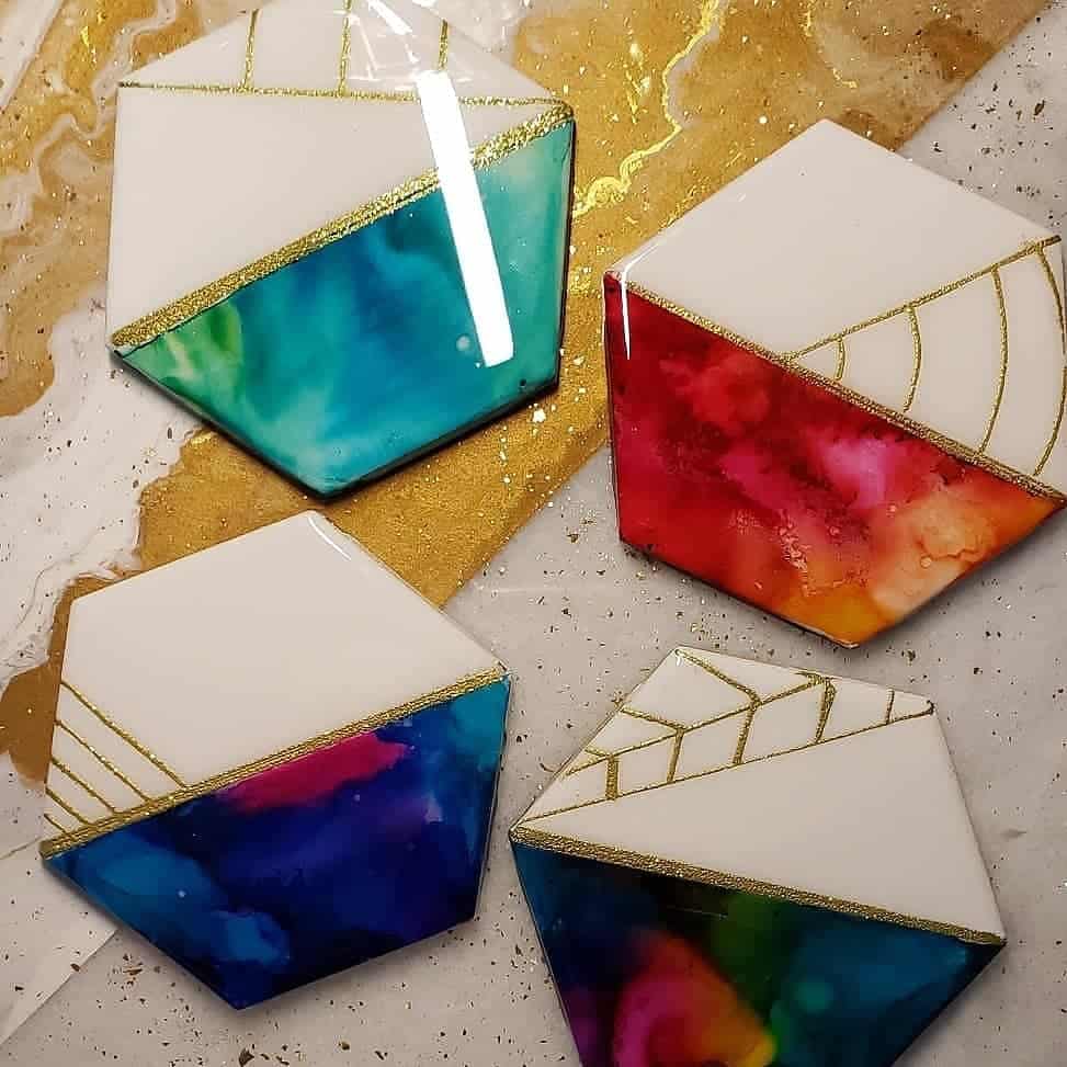
Geometric Patterns: Many of us like to embellish pours, and this is a great way to do it! Thin, simplistic geometric patterns have been rising in popularity for the past few years, and it looks like 2020 is the time they’ll get to shine. To create geometric patterns over your pours, you can use a ruler and gold paint pen, gold leaf, or even washi tape.

Neutrals and Earth Tones: 2019 was all about shades of gray, but it looks like 2020 will shift from gray to warm neutrals and earth tones. Look to photos of natural landscapes for inspiration; there’s nothing better to reference for natural colors than nature itself.
Maximalism: The past few years have been about minimalism, but 2020 will see a shift towards maximalism and extravagance. Now, maximalism doesn’t mean gaudy, but rather layering pieces of different colors and textures to create bold, interesting spaces. This will be a good time for triptychs and other multi-surface pieces.
Things That Are Out
Unfortunately, there’s one important material that’s on it’s way out, and some of us have already noticed the change…subway tile. Because of the shift into geometric patterns and soft corners, square ceramic tiles and subway tiles are not being stocked in stores as prevalently. This could cause some issues if you’re someone that regularly makes coasters.
However, that might mean that octagonal tiles or even round tiles become available, which could be a lot of fun to work with!
Mosaics will also leave us as a trend for 2020. This may mean that those of you who create 3D mosaics with glass and other items will have a hard time finding prefabricated pieces to make them. However, this will also give you the opportunity to find new ways to create your mosaics, so we’ll chalk this up to a learning experience instead of a negative.
Final Thoughts
Keeping up with trends is important if you plan on selling poured home decor or things like cutting boards and coasters. But, these are just trends—your style should focus on the colors and designs that make you feel good! If you decide to experiment with any of these trends, let us know in the group.
In the next Pour it Out, we’re going to talk about the group’s statistics: it’s going to be a fun one!

Sara Wagner is an author and artist from Upstate New York. She is the owner of Studio Blackwater and can typically be found covered in paint, cats, or her two young daughters. You can find her on Facebook and Instagram as @studioblackwater.

Sarah…long time no chat!! I really enjoyed this article. I have only done glass once and I think I got lucky. I did it maybe two years ago and I didn’t know you were spose to seal it. It still looks ok though.
I hope you and your family have a blessed New Year????
Great article. Using blue in pours won’t be a stretch for most artists as a lot seem to gravitate toward the blues anyway.
I knew that grays would be out fairly soon after I saw so many people painting or decorating their house in grays. It’s just too cold of a color to stay around that long. I told my sister the same thing when she painted her new house gray inside. 😉 After decades of seeing fads come and go and colors always seemed to go back to earth tones, I knew this was bound to happen soon.
The geometric shapes is something new I hadn’t heard of or given much thought to so this was an interesting point you brought up.
Thanks for the article.