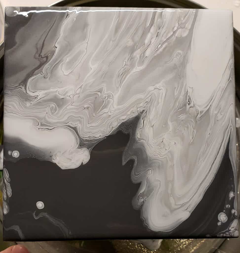
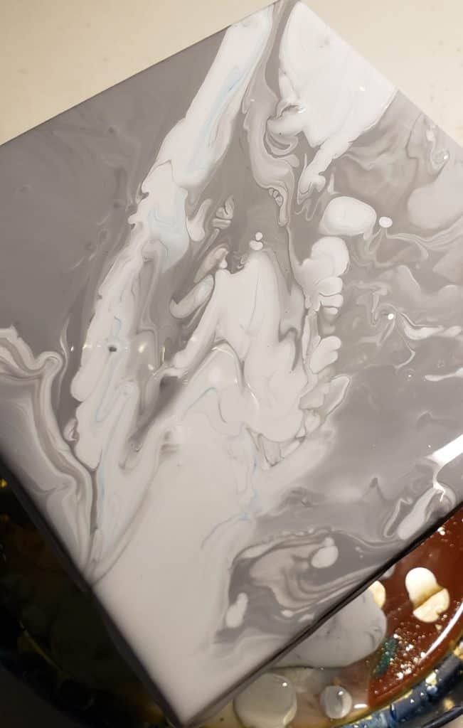
I’ve been on a gray kick lately—and I don’t mean my mood! It seems like soft or deep cool grays have found their way into every corner of my life… my studio walls, my clothes, and now, my pours.
Creating a gray monochromatic pour might not seem very exciting, but there’s something very classy about an understated, muted palette that fits into just about any home’s decor.
Supplies I Used
- Liquitex Basics Acrylic Paint in White and Mars Black
- Nicole’s Craft Paint in Admiral (a rich, deep navy)
I love to create a very cashmere-soft gray by mixing six parts white with about one part black and a few drops of Admiral. Depending on the amount of black, the color can be deep and rich or “rain cloud on a spring day” light. If you use a navy to tint your gray, just be extra sure to mix thoroughly and don’t add too much, or you’ll end up with more of a dusty blue.
Choosing Grays
I have a belief that less is more when it comes to choosing shades for a monochromatic pour. Depending on your desired result, you’ll want to choose your color combination.
Light, medium, dark

You’ll get a lot of contrast and will also hit a large range of color mixtures as light mixes with medium, dark with light etc.
Medium, dark or light, medium

You will see more subtle swirling and patterns which can be very appealing in their ghostly appearance. Expect less contrast between colors.
Time to Pour!
If you’ve chosen a high contrast combination, layer your colors accordingly in your cup. For example, do a light layer followed by your darkest layer, followed by light, followed by medium—you get the drift!
You can use any pouring technique to create a monochromatic pour. Tree ring pours are especially stunning and pairing them with a monochromatic color scheme can give a very natural appearance to your creation.
Be creative with your technique, and choose your colors wisely to achieve your perfect monochromatic masterpiece!

Sara Wagner is an author and artist from Upstate New York. She is the owner of Studio Blackwater and can typically be found covered in paint, cats, or her two young daughters. You can find her on Facebook and Instagram as @studioblackwater.

Thank you! I know this information and do a lot of monochromatic work. However, for those who do not know, this information in invaluable!!!!! I know a lot of folks will benefit. Thanks again.
I agree! Monochromatic is very elegant and kind of soothing, I think.
On the cover image you’ve used gold. Is that gold leaf, paint? Can you share how you achieved that look?
Hello! I poured a monochromatic pour, and then swirled in a touch of gold when the pour was was starting to set. Then, once the piece was completely dry, I sealed it with a layer of Polycrylic and sprinkled gold leaf on top. I sealed with an additional coat of Polycrylic and then when that was cured, I sealed with resin.
Good morning Sara, can I see the actual pour in those shades of gray on Youtube??? Would love to see you do it. It looks gorgeous with the addition of gold. Is it gold leaf?
Thank you for sharing. I am very new to this, but love playing with colours. What would life be without colours??
Hopefully I’ll have the capability to record a few tutorial videos soon!
In the cover photo, I did the monochromatic pour and then when the paint was nearly set, I swirled a touch of gold in. Then, I sealed with Polycrylic and added a few sprinkles of gold leaf while the Poly was still wet, and when the poly was cured, I sealed it with resin. Colors make the world go round!
Oh my goodness. It is true……….that gray is so calming and soothing. I am so glad I saw this and I now know what I will be doing tomorrow; an acrylic pour with grays! Thanks so much for your valuable information Sara.
I hope you post your grey pour in our group! I just love how calming and tranquil grey can be.