Color theory. I’ll be honest, when I first heard this term a few years ago, I felt a little overwhelmed. I’d been sketching, painting, and “arting” (as my family called it), for about 20 years and had never thought much about the logic behind what I was doing.
Supplies I Used
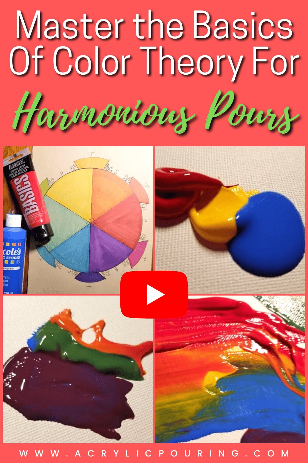
Color wheel
Artist’s palette
Palette knives
The thing about color theory is that, no matter whether you’re an experienced, self-taught artist or a beginner who is formally educated, it applies. You might already be using many aspects of color theory and not even realize it!
In this article, we’ll cover the very basics of color theory and how it applies specifically to acrylic pouring.
What Is Color Theory?
Color theory is a set of guidelines that provides practical information regarding the combination and mixing of colors. If you have ever taken an art class, even an elementary art class, you have likely studied different aspects of color theory.
A useful concept in color theory is the separation of primary, secondary, and tertiary colors. By understanding the colors that comprise each category and how they work together, you can avoid muddy pours (which we’ll cover in a bit).
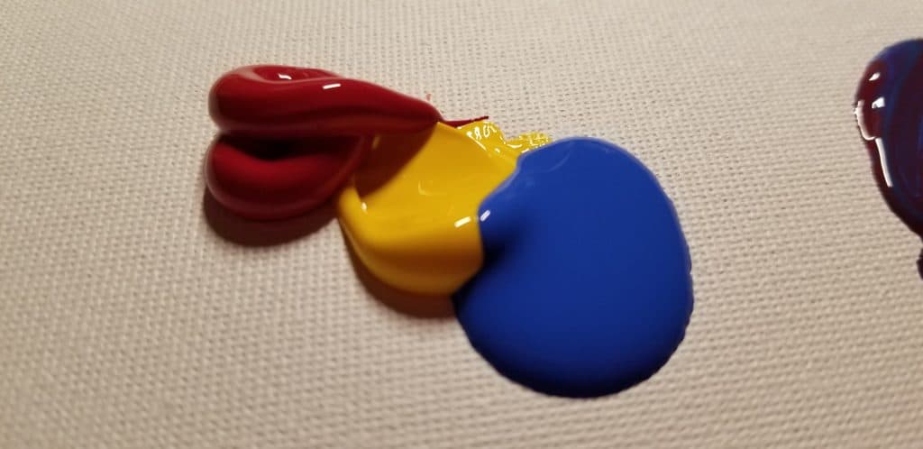
The primary colors are red, yellow, and blue. These colors are primary because they cannot be created using a combination of any other colors. This means that you cannot make these colors—but if you have them, you’ll be able to make other colors.
The secondary colors are green, orange, and purple. These colors are secondary because they can be created directly using a combination of two primary colors:
- Blue + Yellow = Green
- Red + Yellow = Orange
- Red + Blue = Purple
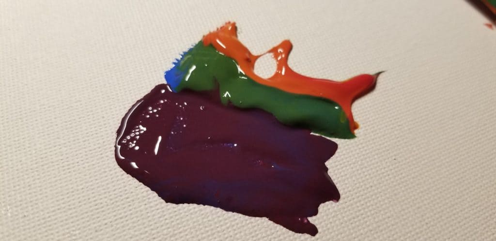
The best thing about secondary colors is that if you have all three primary colors, you’ll always have secondary colors! Mixing primaries in varying amounts will yield different secondary shades, for the ultimate customization.
The tertiary colors are red-orange (vermillion), red-purple (magenta), yellow-orange (amber), blue-green (teal), blue-purple (violet), and yellow-green (chartreuse).
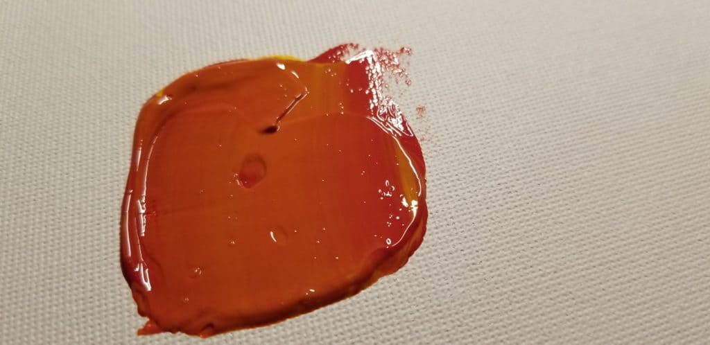
Tertiary colors are created by taking a combination of primary colors, such as red and yellow, to make a secondary color (in this case, orange). Then, the orange would be combined with a primary color, such as red, to create a tertiary color that retains a primarily red hue with undertones of yellow, which appear orange.
This might sound confusing, especially when you start to consider tertiary (and if you’d like to go even further, quaternary colors). But once you have a grasp on these three categories, you will be able to predict the outcome of your pour.
The Color Wheel
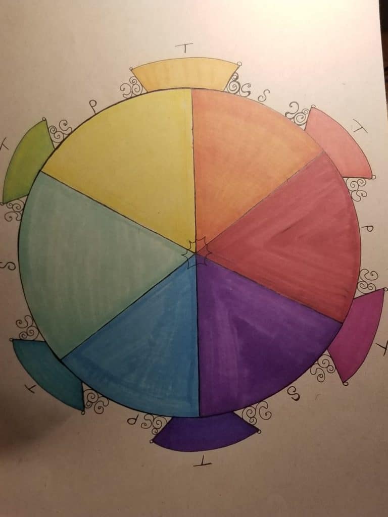
A common tool in the art community is the color wheel. Created by Sir Isaac Newton in 1666, the most basic color wheel can help you determine complementary colors in a variety of ways.
A complementary color is the color on the opposite side of the color wheel from whichever color you choose. In essence, you would select a color, and then draw a straight line from that color to a color directly across from it. Using the color wheel this way will give you two completely different colors that connect harmoniously.
An analogous color scheme uses three neighboring colors on the color wheel to form a harmonious combination. For example, if you chose yellow, you might then choose green and blue to complement it.
A monochromatic color scheme uses two or more different shades of the same color. You might think of black when you think of monochromatic color schemes, but it really applies to any color combination that stays within the same color value. Monochromatic blue, red, and green pours are some of my favorites!
A triadic color scheme uses three different colors that are spaced in the shape of a triangle on the color wheel. Personally, this is one of my favorites because I find color combinations that I never would have thought of myself.
A tetradic scheme uses two adjacent colors and their complementary colors to create a four-color harmony. Using this method, you will get a combination of four colors that complement each other nicely.
Applying Color Theory to Pours
Using the concepts discussed above, you can very effectively plan your pour and predict the results. By understanding the way that primary colors interact with each other, you can avoid the dreaded muddy pour.

A muddy pour is a color combination that accidentally turns out brown, gray, or some other color that you were not expecting (and might not really like). There are a few reasons why your pour might end up muddy:
- Too many colors. Just because you’re using complementary colors doesn’t mean that using a lot of them at once will be successful. Especially if you’re using secondary or tertiary colors, you run the risk of muddied results if you are using more than four colors (excluding white and black).If you’re first starting out, or if you’re getting muddy colors at all, consider scaling back your palette to one or two primary colors and a secondary color to keep things clean.
- Over-swiping, tilting, or manipulating. Excessive paint manipulation can also cause muddiness in a pour, since you are basically mixing the paint together. A good way to avoid this is to remember that you can always add more paint to brighten up particularly dull areas.
By understanding the basics of color theory, you can also predict the outcome of your pour. For example, I love to combine blue, red, and yellow just to watch the rainbow colors that emerge from their mixing; in fact, some of my most successful rainbow pours have come from this combination.

If you plan ahead with your colors both when you’re choosing them and when you’re layering them on the canvas or in your cup, you’ll find that sometimes you can avoid using secondary colors altogether, thus retaining crisp colors and less mud.
Color Theory Rocks!
Understanding color theory is essential for any artist! We want to see what you do with your color theory knowledge. Show us your primary pours, your complementary color pours, and more on the Acrylic Pouring Facebook group.

Sara Wagner is an author and artist from Upstate New York. She is the owner of Studio Blackwater and can typically be found covered in paint, cats, or her two young daughters. You can find her on Facebook and Instagram as @studioblackwater.

A very interesting article about color theory, thank you. This is really important for alle pourers to get good color combinations and not a muddy artwork.
I agree, Thomas. Having a good grasp of color theory is very helpful in deciding color schemes. Glad you liked the article!
Thank you so much, ive always had trouble w/ colors but u made it seem much easier.
A brilliant explanation of the science behind colour… Thank you very much, you have explained to my friend what I could not… Blessed Be
Very useful information. Thanks a lot.
A very clear and concise way of explaining the theory.
This website is informative and easy to understand.
Thank you
I have a theory that innately knowing how to mix colors to get the result you want is akin to innately knowing how to mix notes to get the music sound you want. Some people just know without studying it. Others need to be taught or learn by doing.
Just a very handy information which one can store in his/her coloring knowledge book. this will be helpful while you start painting.
keep sending such very important informative mails.
Great video, makes everything about the color wheel so much clearer! Just drew a new one for myself-thank you!
I would appreciate it if I can join on fb
This is a very good description and to someone like myself who is just starting with pouring, it is good to know. Paint and pouring mediums are very expensive and it will help to limit waste. I wondered if you could possibly do an article on roughly how much medium and paint it takes to do a pour on different size canvases, again to limit waste, or to find you haven’t mixed enough to cover the canvas. Keep up the good work it is good to have basic help when starting out.
I have dabbled in art in one form or another for decades!
I recognized when something I did looked acceptable and when it didn’t but I never knew why!!
Now I’m hoping to learn why and using the info. to avoid the unacceptable and your web site is a great help! Who knows, I might even become competent and consistent someday!!!!